The media objects (like images or videos) on the web page need to be aligned properly to stand out but not completely out of context.
HTML and CSS have their own features to provide the required positioning to the media objects on the webpage.
Bootstrap makes it much easier for the developers to align these media objects as per the content and webpage styling.
With Bootstrap, the media objects can be aligned to the left or to the right of the content.
Such alignments styles are useful for blog comments or tweets where

Basic Bootstrap Media Object
Let’s have a look at a sample code for the Left and right alignment of the media object.
Observer the code followed by the explanation:
Bootstrap Media Left and Right Alignment
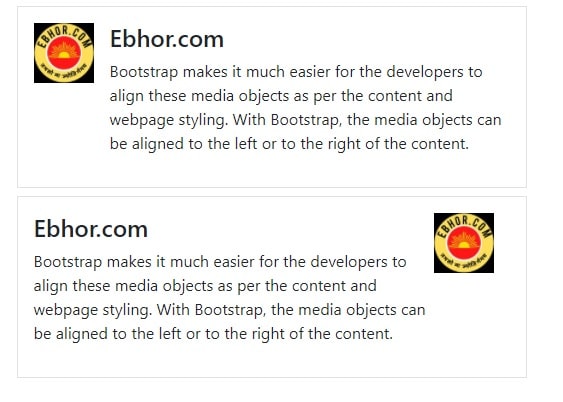
1 2 3 4 5 6 7 8 9 10 11 12 13 14 15 16 17 18 19 20 21 22 | <!-- Left-aligned --> <div class="media border p-3 mt-2"> <img src="http://ebhor.com/wp-content/uploads/2021/05/ebhor_logo_100x.jpg" class="mr-3" alt="Ebhor logo" style="width:60px"> <div class="media-body"> <h4 class="media-heading">Ebhor.com</h4> <p> Bootstrap makes it much easier for the developers to align these media objects as per the content and webpage styling. With Bootstrap, the media objects can be aligned to the left or to the right of the content. </p> </div> </div> <!-- Right-aligned --> <div class="media border p-3 mt-2"> <div class="media-body"> <h4 class="media-heading">Ebhor.com</h4> <p> Bootstrap makes it much easier for the developers to align these media objects as per the content and webpage styling. With Bootstrap, the media objects can be aligned to the left or to the right of the content. </p> </div> <img src="http://ebhor.com/wp-content/uploads/2021/05/ebhor_logo_100x.jpg" class="mr-3" alt="Ebhor logo" style="width:60px"> </div> |
Explanation
- The
<div>element is being used with with the .media class here. This will create a container for media objects to be used. - As for the alignment, we use the appropriate class for the required aligning direction Therefore the
.media-leftclass will be used to align the media object (image in this case) to the left and similarly,.media-rightclass is there to to align it to the right. - The
class= “media-body”is also used with a container in the code. This is to align the text next to the image. - Furthermore, the
.media-headingcan be used for the headings.
Media bootstrap top, middle or bottom alignment
Not just horizontally, we can also set vertical alignments for the media objects.
There are basically three vertical alignments that we generally use in different containers:
- Top: Media object aligned at the top corner of the content
- Bottom: Media object aligned bottom corner of the text content
- Middle: Media object aligned adjacent to vertically middle of the text content
In Bootstrap, these alignments can be made using respectively the classes align-self-start, align-self-centre and align-self-end.
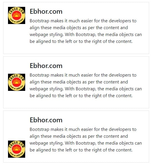
Here’s a sample code for the vertical alignment of the media objects
1 2 3 4 5 6 7 8 9 10 11 12 13 14 15 16 17 18 19 20 21 22 23 24 25 26 27 28 29 30 | <!-- Top-aligned --> <div class="media border p-3 mt-2"> <img src="http://ebhor.com/wp-content/uploads/2021/05/ebhor_logo_100x.jpg" class="align-self-start mr-3" alt="Ebhor logo" style="width:60px"> <div class="media-body"> <h4 class="media-heading">Ebhor.com</h4> <p> Bootstrap .... </p> </div> </div> <!-- Middle-aligned --> <div class="media border p-3 mt-2"> <img src="http://ebhor.com/wp-content/uploads/2021/05/ebhor_logo_100x.jpg" class="align-self-center mr-3" alt="Ebhor logo" style="width:60px"> <div class="media-body"> <h4 class="media-heading">Ebhor.com</h4> <p> Bootstrap.... </p> </div> </div> <!-- Bottom-aligned --> <div class="media border p-3 mt-2"> <img src="http://ebhor.com/wp-content/uploads/2021/05/ebhor_logo_100x.jpg" class="align-self-end mr-3" alt="Ebhor logo" style="width:60px"> <div class="media-body"> <h4 class="media-heading">Ebhor.com</h4> <p> Bootstrap .... </p> </div> </div> |
Nested media object bootstrap
You can also have nested media objects using bootstrap.
These are quite common on social websites these days.
For example, the ‘replies to the comment’ options in websites like Facebook, Twitter, Instagram, etc.
Have employed the nested media object style for their media object positioning.
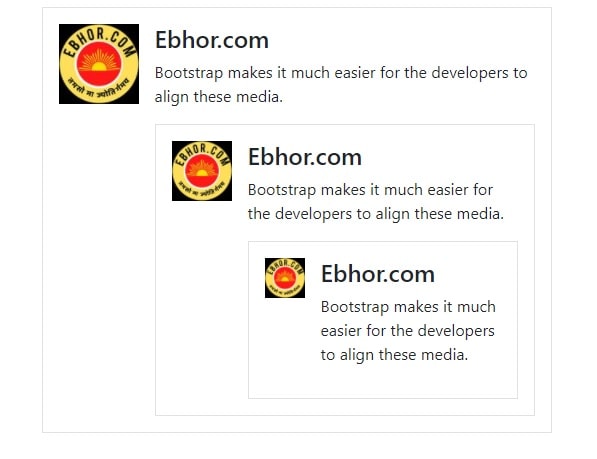
1 2 3 4 5 6 7 8 9 10 11 12 13 14 15 16 17 18 19 20 21 22 23 24 25 26 27 28 29 | <div class="media border p-3 mt-2"> <img src="http://ebhor.com/wp-content/uploads/2021/05/ebhor_logo_100x.jpg" class="mr-3" alt="Ebhor logo" style="width:80px"> <div class="media-body"> <h4 class="media-heading">Ebhor.com</h4> <p> Bootstrap makes it much easier for the developers to align these media. </p> <!-- Nested-media --> <div class="media border p-3 mt-2"> <img src="http://ebhor.com/wp-content/uploads/2021/05/ebhor_logo_100x.jpg" class="mr-3" alt="Ebhor logo" style="width:60px"> <div class="media-body"> <h4 class="media-heading">Ebhor.com</h4> <p> Bootstrap makes it much easier for the developers to align these media. </p> <!-- Nested-media --> <div class="media border p-3 mt-2"> <img src="http://ebhor.com/wp-content/uploads/2021/05/ebhor_logo_100x.jpg" class="mr-3" alt="Ebhor logo" style="width:40px"> <div class="media-body"> <h4 class="media-heading">Ebhor.com</h4> <p> Bootstrap makes it much easier for the developers to align these media. </p> </div> </div> </div> </div> </div> </div> |