Here we will study
Bootstrap 4 images Shapes
Using Bootstrap, the images can be rendered in the following three shapes:
- Rounded Corners:
- Circle
- Thumbnail
Out of these three, the first two are not supported by IE8 or earlier versions
Bootstrap Rounded Corners images
For rounded corners, you can use the .rounded class with your <img> tag.
For example:
1 | <img src="http://ebhor.com/wp-content/uploads/2021/07/1.jpg" class="rounded" alt="city"> |
Circle images in bootstrap
Adding the .rounded-circle class to <img> the tag will shape your image into a circle.
For example:
1 | <img src="http://ebhor.com/wp-content/uploads/2021/07/1.jpg" class="rounded-circle" alt="city"> |
Thumbnail images bootstrap
The thumbnail shape can be achieved using the .img-thumbnail class.
For example:
1 | <img src="http://ebhor.com/wp-content/uploads/2021/07/1.jpg" class="img-thumbnail" alt="city"> |
Bootstrap images responsive
The sizes of the images and screens might not go hand-in-hand more often than you can predict.
We need to have responsive images that can automatically adjust as per the size of the screen.
We can make the images responsive using the class. .img-fluid class with the <img> tag.
Now, the image will, nicely, scale to the parent element.
When using .img-fluid
See the code below for example:
1 | <img src="http://ebhor.com/wp-content/uploads/2021/07/1.jpg" class="img-fluid" alt="city"> |
Bootstrap Images Gallery
The image gallery can be created by using Bootstrap’s grid system along with the .thumbnail class.
The code below illustrated the same:
1 2 3 4 5 6 7 8 9 10 11 12 13 14 15 16 17 18 19 20 21 22 23 24 25 26 27 | <div class="row"> <div class="row"> <div class="col-md-4"> <div class="thumbnail"> <img src="http://ebhor.com/wp-content/uploads/2021/07/1.jpg" alt="Image1" style="width:100%"> <div class="caption"> <p>Image One</p> </div> </div> </div> <div class="col-md-4"> <div class="thumbnail"> <img src="http://ebhor.com/wp-content/uploads/2021/07/1.jpg" alt="Image2" style="width:100%"> <div class="caption"> <p>Image Two</p> </div> </div> </div> <div class="col-md-4"> <div class="thumbnail"> <img src="http://ebhor.com/wp-content/uploads/2021/07/1.jpg" alt="Image2" style="width:100%"> <div class="caption"> <p>Image Three</p> </div> </div> </div> </div> |
Bootstrap Responsive Embeds
Not only the images but the o
For <div> item.
You will also need to add the .embed-responsive-item to your <iframe>, <embed>, <video>, and <object> elements.
1 2 3 | <div class="embed-responsive embed-responsive-16by9"> <iframe class="embed-responsive-item" src="https://www.youtube.com/embed/6zXFtjWIdSE" allowfullscreen=""></iframe> </div> |
What is aspect ratio?
The aspect ratio of any image can be described as the proportional relationship between the image’s width and height.
The most common video aspect ratios we have are 4:3 which was a universal video format of the 20th century and 16:9 that is commonly known for the HD television.
We have two classes for these aspect ratios in Bootstrap:
- embed-responsive embed-responsive-4by3
- embed-responsive embed-responsive-16by9
1 2 3 4 5 6 7 8 9 10 11 12 13 14 15 16 17 18 19 | <!-- 21:9 aspect ratio --> <div class="embed-responsive embed-responsive-21by9"> <iframe class="embed-responsive-item" src="..."></iframe> </div> <!-- 16:9 aspect ratio --> <div class="embed-responsive embed-responsive-16by9"> <iframe class="embed-responsive-item" src="..."></iframe> </div> <!-- 4:3 aspect ratio --> <div class="embed-responsive embed-responsive-4by3"> <iframe class="embed-responsive-item" src="..."></iframe> </div> <!-- 1:1 aspect ratio --> <div class="embed-responsive embed-responsive-1by1"> <iframe class="embed-responsive-item" src="..."></iframe> </div> |
Bootstrap <img> Classes
Bootstrap has the following classes for styling your image elements
- .rounded: To add rounded corners to the image
- .rounded-circle: To shapes the image into a circle
- .img-thumbnail: To shape the image into a thumbnail
- .img-fluid: To make the image responsive make it scale nicely to the parent element.
Bootstrap center images
Block-level images can be centered using .mx-auto
1 | <img src="http://ebhor.com/wp-content/uploads/2021/07/1.jpg" class="rounded mx-auto d-block" alt="city"> |
bootstrap images in a row
1 2 3 4 5 6 7 8 9 10 11 12 13 14 15 16 17 18 | <div class="row"> <div class="col-lg-3 col-md-4 col-6"> <a href="#" class="d-block mb-4 h-100"> <img class="img-fluid img-thumbnail" src="https://source.unsplash.com/TlUwJ4pMc90/400x300" alt=""> </a> </div> <div class="col-lg-3 col-md-4 col-6"> <a href="#" class="d-block mb-4 h-100"> <img class="img-fluid img-thumbnail" src="https://source.unsplash.com/wE3wKZSMnrs/400x300" alt=""> </a> </div> <div class="col-lg-3 col-md-4 col-6"> <a href="#" class="d-block mb-4 h-100"> <img class="img-fluid img-thumbnail" src="https://source.unsplash.com/G9bDsVeHM7I/400x300" alt=""> </a> </div> </div> |
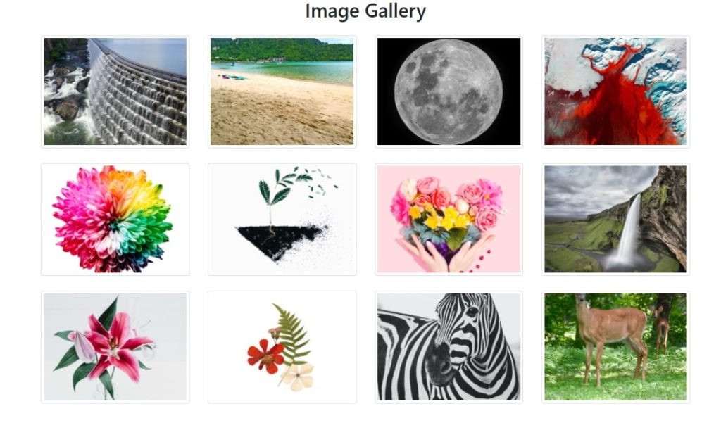
Good Reference image Gallery
See Multiple Gallery
Bootstrap images side by side
Create a row and divide the row into columns inside column insert image.
This will display images side by side
How to make images responsive in bootstrap
To make images responsive in bootstrap use .img-fluid class
1 2 | <div class="row"> <img src="http://ebhor.com/wp-content/uploads/2021/07/1.jpg" class="img-fluid" alt="city"> |
Bootstrap background image
Showing image in background is very simple
use background-image: url(..) css property with url.
Example of background image is as below