Here, we will check out the Containers, one of the most basic web page layouts employed by Bootstrap to design the web pages.
But before we move into that, let us first understand what a layout is and how a typical layout is made to come to
Bootstrap Responsive Webpage Layout
A webpage layout is basically the template that helps you understand the sizing, positioning, and styling of all its components.
More or less, every layout takes care of the following points:
- Header: The top part of the webpage. It usually contains your website’s logo or name.
- Navigation Section: This is the section of the page where all the Navbars are present. These can be normal navigation menus or drop-down carrying sub-menu of the selected menus.
- Content Section: The content section contains all the necessary stuff for that web page.
- Footer: The footer section of the web-page generally contains links to official stuff about the website or web application. You can find the links for Privacy Policy, About Us and Available Downloads from this part of the page.
This is the basic layout of any web page you’ll come across. A code below will show you a typical web page using the above-mentioned layout:
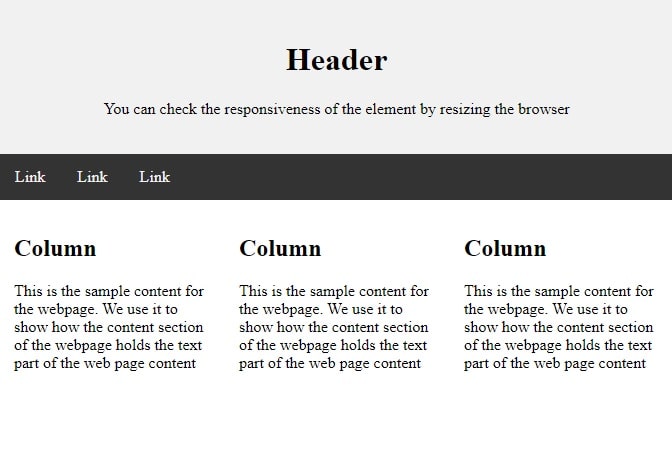
1 2 3 4 5 6 7 8 9 10 11 12 13 14 15 16 17 18 19 20 21 22 23 24 25 | <body> <div class="header"> <h1>Header</h1> <p>You can check the responsiveness of the element by resizing the browser</p> </div> <div class="topnav"> <a href="#">Link</a> <a href="#">Link</a> <a href="#">Link</a> </div> <div class="row"> <div class="column"> <h2>Column</h2> <p> This is the sample content for the webpage. We use it to show how the content section of the webpage holds the text part of the web page content </p> </div> <div class="column"> <h2>Column</h2> <p> This is the sample content for the webpage. We use it to show how the content section of the webpage holds the text part of the web page content </p> </div> <div class="column"> <h2>Column</h2> <p>This is the sample content for the webpage. We use it to show how the content section of the webpage holds the text part of the web page content</p> </div> </div> </body> |
Bootstrap Container
The Bootstrap container layout is one of the most basic layouts for a webpage.
When you’re using the grid-system for your webpage, the Bootstrap Container layout can help you the best.
Above-mentioned we’ll have to choose from fixed-width/ fluid-width, responsive containers that suit best for our webpage vision.
div class container
The code below will illustrate the Bootstrap container’s usage on the web page:
1 2 3 4 | <div class="container"> <h2>Hello, world!</h2> <h3>Example of container class</h3> </div> |
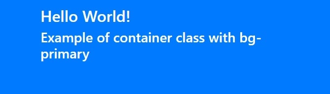
Bootstrap container background color
1 2 3 4 | <body class="container p-3 mb-2 bg-primary text-white"> <h2>Hello World!</h2> <h3>Example of container class with bg-primary</h3> </body> |
Try these background colors
| Sr No | Background Color | Run It |
|---|---|---|
| 1 | bg-primary | Try It |
| 2 | bg-secondary | Try It |
| 3 | bg-success | Try It |
| 4 | bg-danger | Try It |
| 5 | bg-warning | Try It |
| 6 | bg-info | Try It |
| 7 | bg-light | Try It |
| 8 | bg-dark | Try It |
| 9 | bg-white | Try It |
Bootstrap container fluid class
You can also use .container-fluid for using a full-width container that will span the entire width of the viewport.
1 2 3 4 | <div class="container-fluid"> <h2>Hello, world!</h2> <h3>Example of container class</h3> </div> |
Your div element should have the class container-fluid
To create the class as container-fluid use this with div as below
1 2 3 | <div class="container-fluid"> <p>Hello, world!</p> </div> |
Which class in bootstrap make container full width
.container-fluid class in bootstrap make container full width
Difference between container and container fluid
The .container has fixed width for each screen size.
The .container-fluid has full width (100%) for each screen size.