Alert messages are useful for the websites every now and then.
They might indicate some failed validation or notify a successful registration for the user.
Either way, their appearance is an important aspect to work on.
Bootstrap has many features for Alert Messages as well.
It provides the developers some easy ways in which they can create and style predefined alert messages.
The class, generally, used for the Alerts is the .alert class.
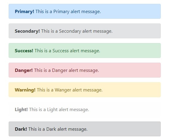
Bootstrap Alert Message Classes
There are the following contextual classes that can be used for different types of alerts:
.alert-primary: This is a primary alert to show information.
.alert-secondary: This is a grey background color alert box to show general information.
.alert-success: This alert message is used to represent a success message.
.alert-danger: Background color – Red. This indicates any dangerous i.e. potentially negative action.
.alert-warning: Background color – Yellow. This is different from alert-danger as this can be used to suggest some caution to avoid any potentially negative action rather than notifying it.
.alert-info: Background color – Light-blue. This is just a piece of information that the user needs to be notified about. Generally, any informative action is indicated using this alert.
.alert-light: This alert box is used to represent data in the light color alert box.
.alert-dark: This alert box represents data in the dark box.
Here’s the sample code for using these classes:
Bootstrap success message
Alert css code for bootstrap success message is
<div class="alert alert-success">
1 2 3 | <div class="alert alert-success"> <strong>Success!</strong> This is a successful alert indicating a positive action. </div> |
Bootstrap info
Alert info CSS is <div class="alert alert-info">
1 2 3 | <div class="alert alert-info"> <strong>Info!</strong> This is an informative alert indicating a neutral change or action. </div> |
Bootstrap alert warning
We can create alert warnings by including .alert-warning CSS class
<div class="alert alert-warning">
1 2 3 | <div class="alert alert-warning"> <strong>Warning!</strong> This is a warning alert indicating some action that might need your attention. </div> |
Bootstrap warning color
Bootstrap warning color is FFF3CD in hexadecimal and rgb(255,243,205) in rgb color combination.
Bootstrap alert danger
Alert danger can be created by adding .alert-danger CSS <div class="alert alert-danger">
1 2 3 | <div class="alert alert-danger"> <strong>Danger!</strong> This is a danger alert indicating some potentially negative action. </div> |
Apart from these 4, there are some other classes that can be used for different purposes with alerts. Let’s have a look
Bootstrap error message
We can use bootstrap alerts for error messages .alert-warning and .alert-danger can be used to show normal and critical error messages.
1 2 3 4 5 6 | <div class="alert alert-warning"> <strong>Danger!</strong> This is a warning alert indicating some potentially negative action. </div> <div class="alert alert-danger"> <strong>Danger!</strong> This is a danger alert indicating some potentially negative action. </div> |
Bootstrap Alert Links
You can add some matching links with matching foreground and background colors using the .alert-link class.
These links can be used to redirect the user to some detailed information about the alert.
1 2 3 | <div class="alert alert-success"> <strong>Success!</strong> You should <a href="#" class="alert-link">read this message</a>. </div> |
Bootstrap Closing Alerts
In some cases, the user may want to remove the alert ones they have addressed it.
This can be done by using dismissible or closable alerts.
In order to do
You also need to add class="close" and data-dismiss= to some link or a button element.
Therefore, when you click on this element the alert box will disappear.
Here’s the code to understand this better:
1 2 3 4 | <div class="alert alert-success alert-dismissible"> <a href="#" class="close" data-dismiss="alert" aria-label="close">×</a> <strong>Success!</strong> Indicates a successful or positive action. </div> |
Observe the ‘aria-label’ and ‘×’ in the above code.
These two have an important role in this code. The aria-label= “close” attribute is there to have a better accessibility for the close button.
The ‘×’ or the (×) is actually a better and more preferable way of indicating the close button instead of using the ‘x’ symbol.
Bootstrap Animated Alerts
The two classes used to add an animated fade effect for when closing the alert messages are .fade and .in.
Bootstrap Close Alerts via data-* Attributes
Another way of creating a dismissible alert is by using the data-dismiss= attribute to any link or button element.
Just like the .alert-dismissible class, this too shall close the alert message using the link/button element.
Bootstrap dismissable alert
1 | <a href="#" class="close" data-dismiss="alert" aria-label="close">×</a> |
Bootstrap alert fade out
1 | <a href="#" class="close" data-dismiss="alert" aria-label="close">×</a> |