The grid system in Bootstrap 4 is built using flexbox. It allows a maximum of 12 columns across the web page.
In case you do not need to use all the 12 columns available, you can group individual columns to get wider columns for your usage.


Due to the responsiveness of the grid system, the columns get re-arranged automatically as per the screen size of the operating device.
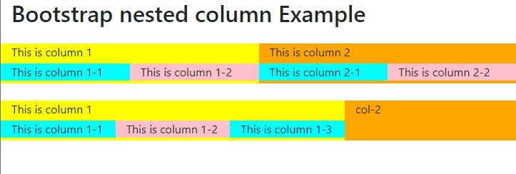
Bootstrap nested columns example
Bootstrap Grid Classes
Here’s the list of the classes available for Bootstrap’s grid system:
.col – It is for very small devices that have a screen width of less than 576px
.col-sm– This is for the devices having screen width equal to or greater than 576px
.col-
.col-
.col-xl – Used for very large devices that have
| Sr No | CSS Class | Example |
|---|---|---|
| 1 | .col | Try It |
| 2 | .col-sm | Try It |
| 3 | .col-md | Try It |
| 4 | .col-lg | Try It |
| 5 | .col-xl | Try It |
For more creating more dynamic and flexible layouts, the
Please note that since each class scales up, so if you want to set
Bootstrap column classes basic structure
Take a look at the basic structure of the Bootstrap 4 grid:
1 2 3 4 5 6 7 8 9 10 11 12 13 14 15 | <div class="row"> <div class="col-*-*"></div> <div class="col-*-*"></div> </div> <div class="row"> <div class="col-*-*"></div> <div class="col-*-*"></div> <div class="col-*-*"></div> </div> <div class="row"> <div class="col"></div> <div class="col"></div> <div class="col"></div> </div> |
Explanation for the First example: Here we are creating a row (<div class="row">).
Then we added the required columns using suitable .col-*-* classes.
Here the first star (*) tells you the responsiveness i.e. sm,
This number should
Thus, for equal width columns we have: two “col” elements = 50% width each and three cols = 33.33% width each and so on.
The responsiveness of the columns can be set as per the requirements.
Here are some more examples for different column requirements:
Bootstrap grid examples
Bootstrap 12 column grid
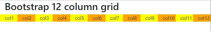
1 2 3 4 5 6 7 8 9 10 11 12 13 14 | <div class="row"> <div class="col-1" style="background-color:yellow">col1</div> <div class="col-1" style="background-color:orange">col2</div> <div class="col-1" style="background-color:yellow">col3</div> <div class="col-1" style="background-color:orange">col4</div> <div class="col-1" style="background-color:yellow">col5</div> <div class="col-1" style="background-color:orange">col6</div> <div class="col-1" style="background-color:yellow">col7</div> <div class="col-1" style="background-color:orange">col8</div> <div class="col-1" style="background-color:yellow">col9</div> <div class="col-1" style="background-color:orange">col10</div> <div class="col-1" style="background-color:yellow">col11</div> <div class="col-1" style="background-color:orange">col12</div> </div> |
Bootstrap Grid Three Equal Columns
1 2 3 4 5 | <div class="row"> <div class="col">.col</div> <div class="col">.col</div> <div class="col">.col</div> </div> |
Bootstrap Grid Responsive Columns
The following example will demonstrate, how you can create four equal-width columns.
These will start at tablets and will then scale to extra-large desktop screens.
1 2 3 4 5 6 | <div class="row"> <div class="col-sm-3">.col-sm-3</div> <div class="col-sm-3">.col-sm-3</div> <div class="col-sm-3">.col-sm-3</div> <div class="col-sm-3">.col-sm-3</div> </div> |
Responsive columns can be used with devices whose screens width are less than 576px like mobile, the above columns will get stacked on top of each other, automatically.
Bootstrap two column Unequal Responsive Grid
Another example with columns scaling from the tablet screens to extra-large desktop screens. Furthermore, the columns here, will have varied width.
1 2 3 4 | <div class="row"> <div class="col-sm-4">.col-sm-4</div> <div class="col-sm-8">.col-sm-8</div> </div> |
Thus, depending on the requirement, you can use the Bootstrap grid system to provide responsive columns for different devices.
How to put divs next to each other
Bootstrap column resolves this problem.
create a new row and inside row create columns
1 2 3 4 | <div class="row"> <div class="col-sm-4">.col-sm-4</div> <div class="col-sm-8">.col-sm-8</div> </div> |
Bootstrap offset left Example
To create offset we use class offset-*-*.
for small devices it is offset-sm-1

1 2 3 4 5 6 7 8 | <div class="row"> <div class="col-sm-4" style="background-color:yellow">col-1</div> <div class="col-sm-8" style="background-color:orange">col-2</div> </div> <div class="row mt-4"> <div class="col-sm-4 offset-sm-1" style="background-color:yellow">col-1</div> <div class="col-sm-7" style="background-color:orange">col-2</div> </div> |
Bootstrap columns not side by side
To create columns we use .col class these .col must be inside .row class otherwise it will not show columns side by side
The correct way to place .col is as below
1 2 3 4 | <div class="row"> <div class="col-6" style="background-color:yellow">col1</div> <div class="col-6" style="background-color:orange">col2</div> </div> |
Bootstrap padding/margin between columns
offset-* can be used to provide space between columns
1 2 3 4 | <div class="row"> <div class="col-5" style="background-color:yellow">col-1</div> <div class="col-5 offset-2" style="background-color:orange">col-2</div> </div> |
Bootstrap padding/margin between rows
bootstreap4 uses following properties for margin and padding
m- for margin
p- for padding
it is used with
t- set margin-top or padding-top
b-set margin-bottom or padding-bottom
with size property
0- margin and padding set to 0
1- margin and padding set to 1
etc.